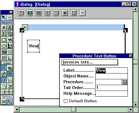

Notice the label is already filled out in the properties. You may change it there, or you may change it in the button itself. They will track each other.
If you wish to address this button in your procedures (as the target of DIM and UNDIM commands, for example), you must assign it an object name. If you are not addressing it in your procedures, there is no need to assign an object name.
The procedure whose name you enter in the "Procedure" portion of the properties is the procedure that will execute when the user presses this button. After you have named it, you may define it (or edit an existing definition) right then and there by clicking the control you see to the right of the procedure name.
The tab order determines the order of button attention if the user presses the tab key to navigate through, and select buttons. Some people like to do that rather than click to select a button.
Whatever Help message you supply will appear as a ballon help to your user when he or she touches the button with the cursor. Ballon helps are a really good thing, they are very helpful to users.
You may declare one button as the default. A default button is already sel-
ected when the menu is presented, so if the user presses Enter it is the same as if he or she had clicked that button. When you have a default declared, then the tab key navigation as described above is overridden and is inoperable.
Before you create a second button read "How to create a same-sized button
." When you are creating multiple buttons, do not worry about how they line up. Later you will use the grid
to line them up.
The Procedure Icon Button:
Click on the Procedure Icon Button object in the def-specific palette, then click inside the frame to create an Icon Button in the definition. When you click inside the frame you can make that click a drag, not only creating an instance of the button but also determining its size all in one operation.
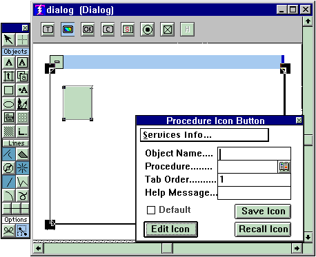
Now you want properties for this object. But before you get them, there is something important to observe. Notice that as you move the pointer around and through this object you have a pencil tool when the cursor is inside the object, and an object select cursor when its on an edge. If you right-click to get properties when you have the pencil tool, you will also be modifying the icon, something that in general you do not wish to do. So make sure that you have the object select cursor along the edge of the button before you right-click to get its properties. You will see as shown below in Figure 2.
The Object Name, Procedure, Tab Order, Help Message, and Default sections of the properties are exactly as described above for text buttons.
Whats different about this type of button is that you are going to supply an icon for the button label. You can either recall an icon from the icon library and paste it into the button, or you can create a new icon. If you create a new icon you probably will want to save it in the icon library so you won't have to create it again.
To see more about creating icons, or the icon library, see "Creating Icons
."
Before you create a second icon button be sure to read "How to create same sized buttons
." When you are creating multiple buttons, do not worry about how they line up. Later you will use the grid
to line them up.
Figure2.

Copyright © 2019 , WhamTech, Inc. All rights reserved. This
document is provided for information purposes only and the contents hereof are
subject to change without notice. Names may be
trademarks of their respective owners.