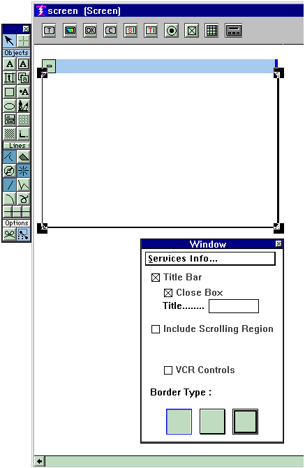

Whatever title you put into the "Title" slot in the properties box will be in the title bar of your definition.
Notice you also see a check box for a VCR control. You will see this in the Frame for Screen definitions, but not for Menu or Dialog definitions. This is an alternate method for getting a VCR control, in addition to the one provided in the def-specific palette.
It is possible to include a scrolling region into your otherwise fixed definitions.
This is most useful for Fixed Screens, but can be used in Menu and Dialog definitions if you want to make your users scroll to see all of the buttons you are providing.
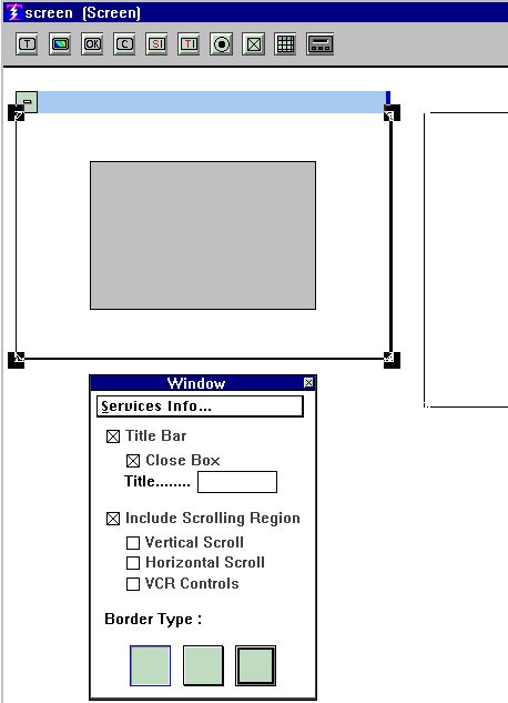
For Fixed Screens it is useful when you do not want to use a Scroller Object, but there are just too many fields to have them all visible in a normal fixed screen. Check the box that asks for a scrolling region, and you see:

Note the gray area inside the Frame, and a secondary Frame that shows up to the right of the primary Frame. (You see the leftmost part of the secondary Frame, we had to crop the screen shot to get it to fit inside the help screen.)
You can size and position the Gray area any way you like inside the primary Frame. And the secondary Frame can be made as large as you need it to be, both long and wide. The width of the secondary frame should never be less than the width of the gray area.
The idea is that you define as many Buttons, Transfer Fields, etc. as you want into the secondary Frame. Just keep stretching it longer until you get everything that you need into it. When you get the grid to line things up be sure the secondary Frame has the attention, or else the grid will go into the primary Frame.
Now mentally take the upper left corner of the secondary Frame and mentally position it on top of the upper left corner of the gray area. The gray area then, would be showing you how much of the secondary Frame is going to show when the screen is in use. The user would then use the scroll bar to scroll down to see the rest of it. (Be sure you have checked the box that calls for a vertical scroll bar.) In effect, that is exactly what happens when the screen is in use. The contents of the secondary frame slide through the part of the screen that is indicated by the gray area.
When the user is tabbing through the fields one at a time, the fields scroll up into view one at a time as you get to them. If you use the J option on the screen command (APPEND, UPDATE, READ) that called for this screen, then they will scroll up a page at a time instead of a field at a time, where a "page" is determined by the size of the gray area.
Copyright © 2019 , WhamTech, Inc. All rights reserved. This
document is provided for information purposes only and the contents hereof are
subject to change without notice. Names may be
trademarks of their respective owners.